Revamping the Uopeople Brand with a Vibrant Design System
Transforming the Student Portal Experience at the University of the People.

Timeline
Apr 2019 - Apr 2023
PLATFORM
Website/ WebApp
MY ROLE
Brand Designer & UX/UI Designer
Overview
Not too long ago, Uopeople’s brand set out on a bit of a makeover adventure in the online education world. We were curious souls, taking notes from some of the top-notch institutes out there. The goal? To make our student experience even better. So, imagine this as a little journey where we played with colors, tweaked our logo, and added some cool elements to our online space. It’s all about bringing in those warm, welcoming vibes and connecting with students globally. Ready to dive into our design story? Let’s roll!
Intro
University of the People (UoPeople) is an online university, founded in 2009. It’s nonprofit, has no physical campus, and students learn online. The admission office is in California.

Research
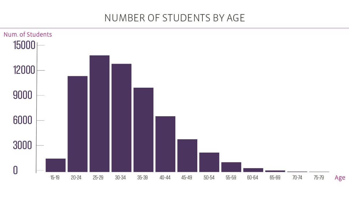
“When I first joined the University, I took a closer look at our student demographics and found that a significant chunk falls within the young age bracket, roughly between 20 to 40 years old. With this insight, I made a conscious decision to revamp our design strategy, aiming to establish a stronger connection with our youthful audience. The shift involved steering away from dark colors and embracing brighter tones, coupled with the introduction of more illustrations and images. The goal was simple: to create a cozier and more welcoming atmosphere for our students.”
Possible audience of UoPeople
Tasked with transforming the visual identity to resonate with our predominantly young audience (20-40 yrs)
Logo Switch-Up:
Old Logo

New Logo

Alternate Logo
The logo reflects the idea that the university is the gateway to higher education. I picked a font that matches the vibe we want. The logo’s focus changes from “university” to “people,” showing that individuals are central to the educational journey.
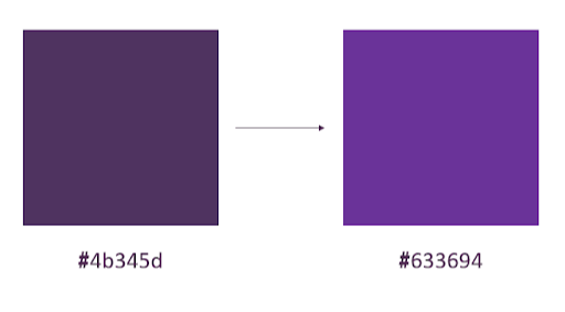
Getting Youthful:
Our students are a young bunch, so we decided to ditch the dark and go for brighter, friendlier colors. The goal? To make everyone feel comfy and welcome.
Adding a Dash of Art:
We tried out different looks, tweaking the colors and putting the spotlight on “People” to shout out that we’re the gateway to higher education.
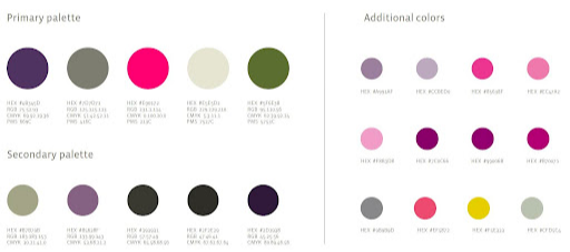
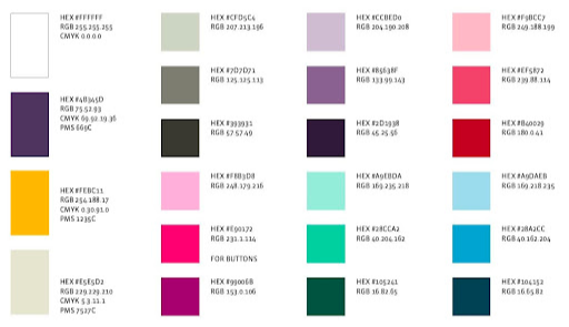
Colors
Colors at Uopeople aren’t just hues; they’re emotions on a canvas. From welcoming brights to cozy tones, each color tells a story of warmth and connection. It’s not just about what you see; it’s about how you feel. Every color is a brushstroke, creating an atmosphere of good vibes and homey comfort.
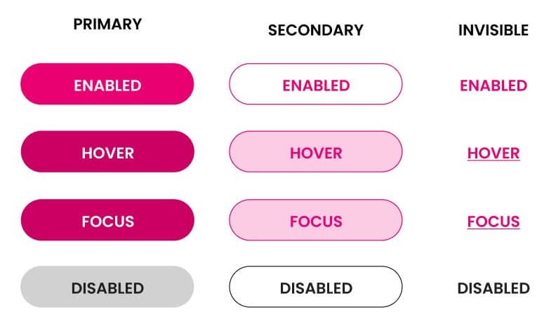
Buttons and Polygon Element:
All About You:
We revamped our buttons to make sure your experience is top-notch and super easy.
Global Connection Symbol:
Ever seen a polygon? We added one to symbolize how we connect people from every corner of the globe. It’s our way of saying, “Hey world, we’re all in this together!”

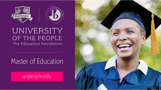
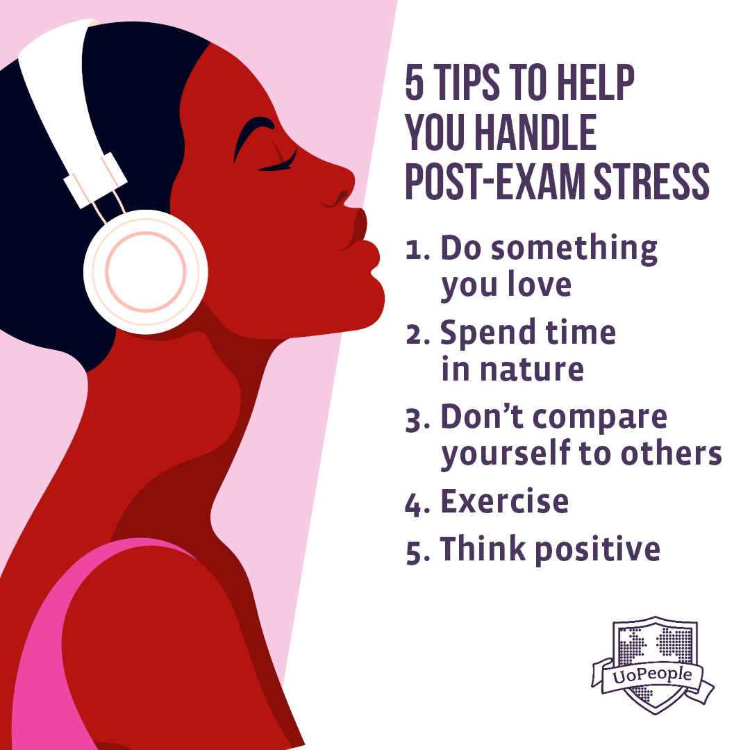
Old vs. New Posts:
Fresh Threads:
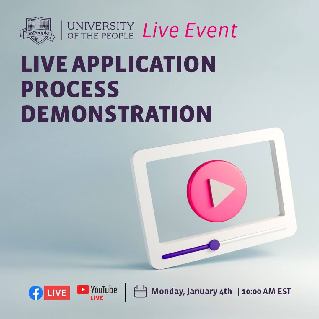
We gave our posts a facelift, making them match our snazzy new brand. Say hello to a sleek and modern user interface
Old Posts

Old Posts
New Posts
Old Posts

Old Posts
Conclusion:
Big Changes, Big Impact:
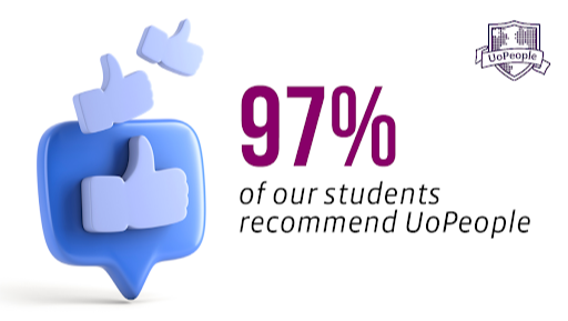
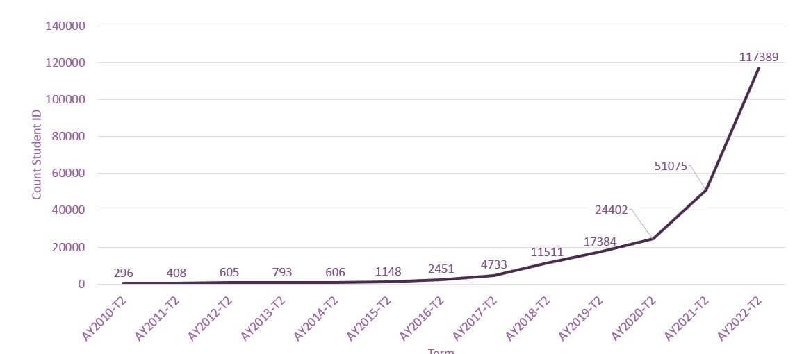
Guess what? Our design adventure wasn’t just for fun. It led to a major boost in registrations! The cool color palette, chill logo, and user-friendly tweaks made a real difference.
In the crazy world of online education, our fresh look didn’t just catch the eye of our audience; it pushed Uopeople into more engagement and growth. Our design isn’t just a pretty face; it’s the heart of our success story, shaping our digital vibe and bringing students from every corner of the world closer together.
Let’s Connect!
Thank you for your time reviewing my work on the University of the People Portal!
If you’d like to get in touch, my contact information is provided below.
Tel
+972-54-5502209
idanshadi@gmail.com