

Key Behavioral Insight
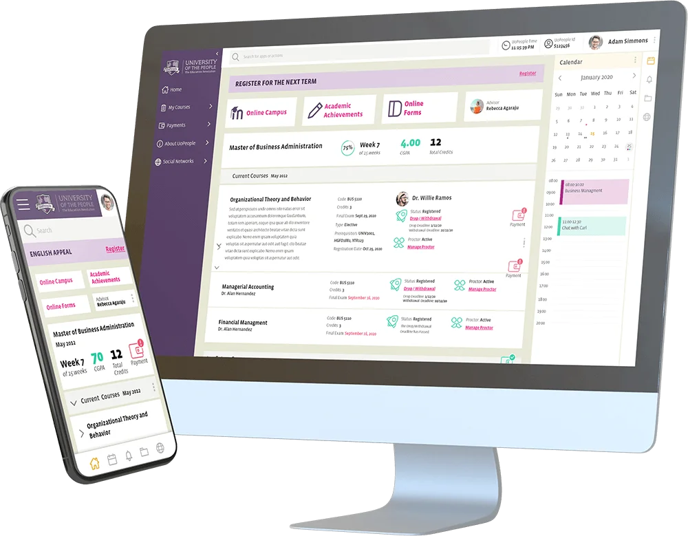
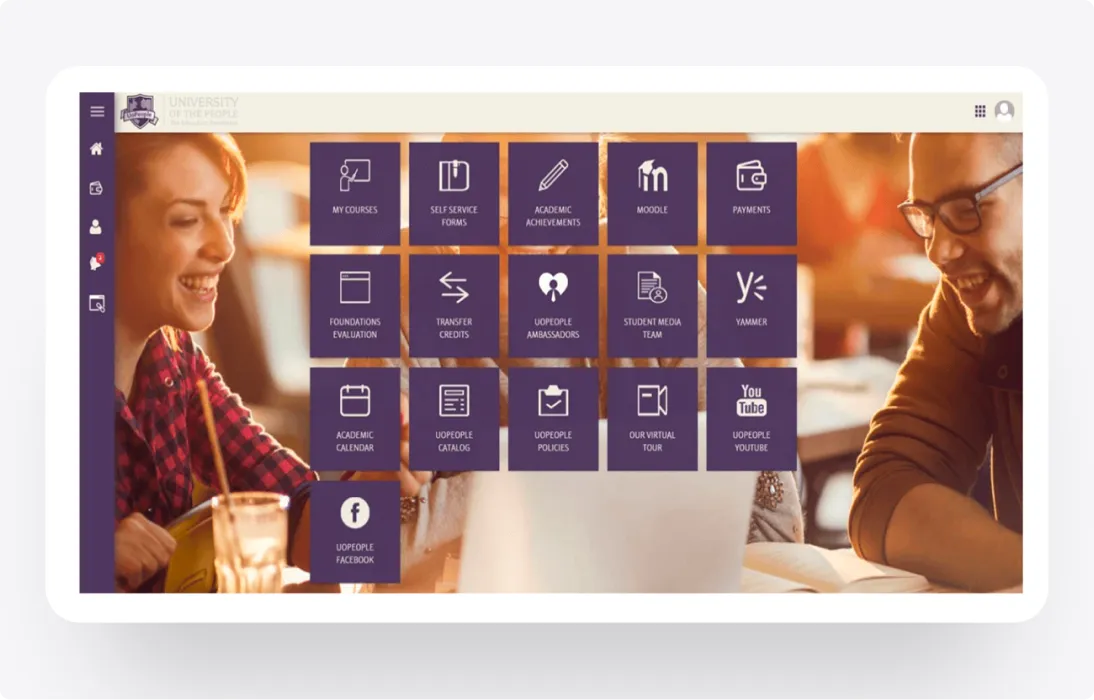
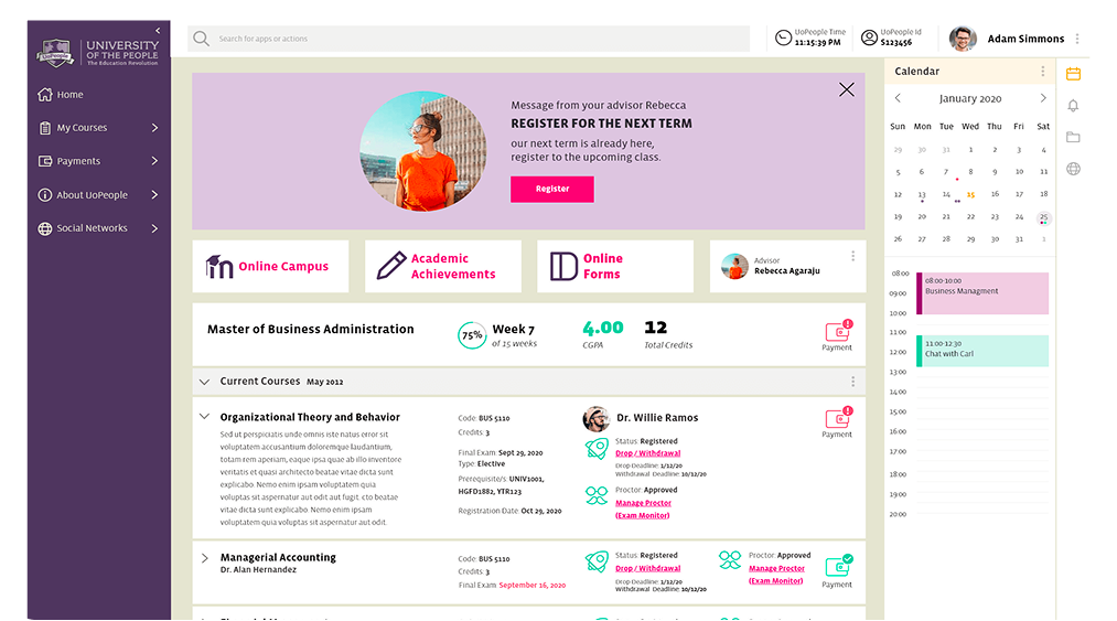
Students interact with the portal in short, focused sessions. They are time-poor and need
clarity immediately—not after exploration.


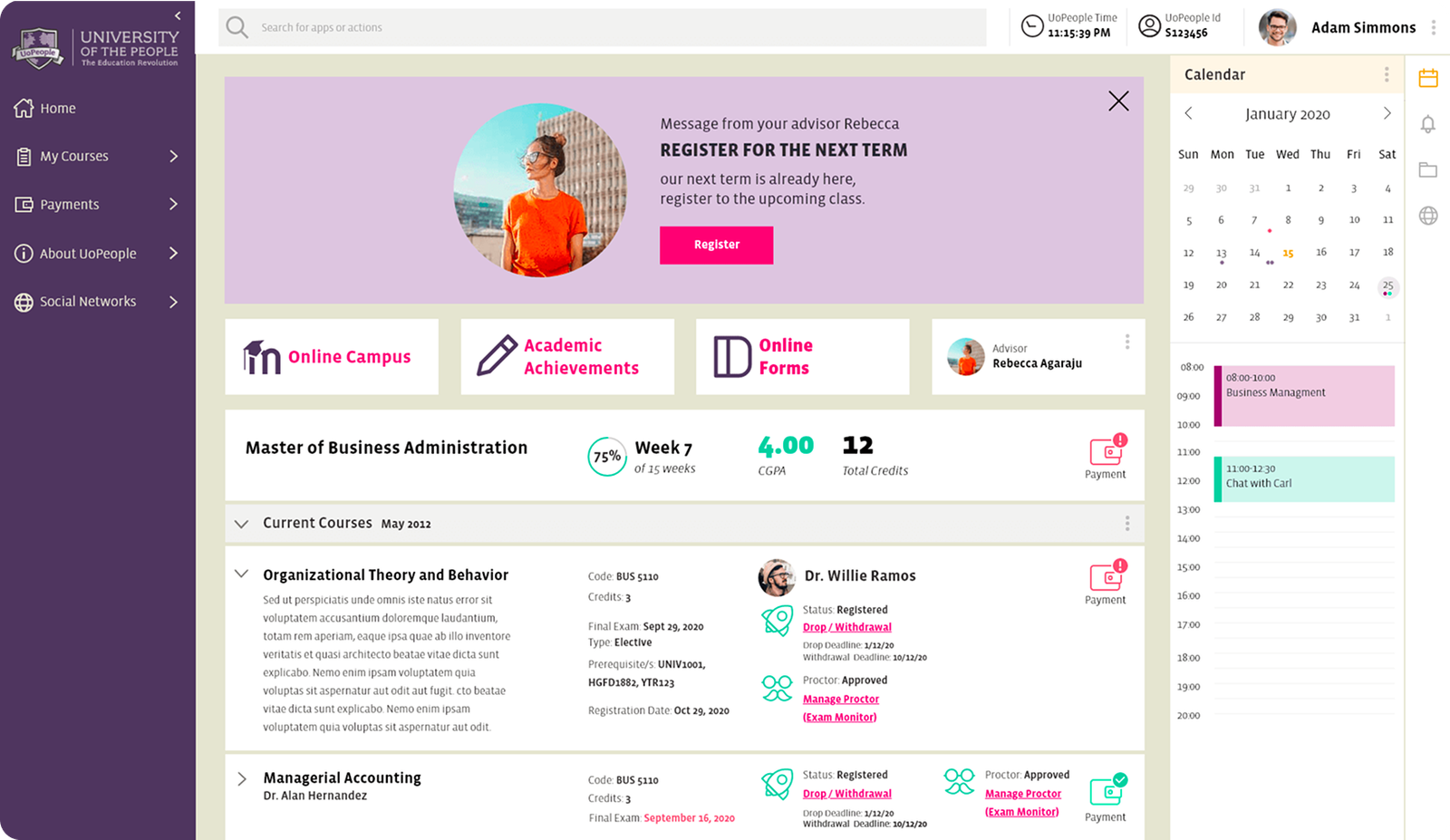
Students interact with the portal in short, focused sessions. They are time-poor and need
clarity immediately—not after exploration.