The system had to work across devices, regions, and very different usage conditions.
University of the People
Student Portal Redesign
Redesigning the student portal for a global online university, making academic navigation simpler, clearer, and more accessible across devices.
Overview
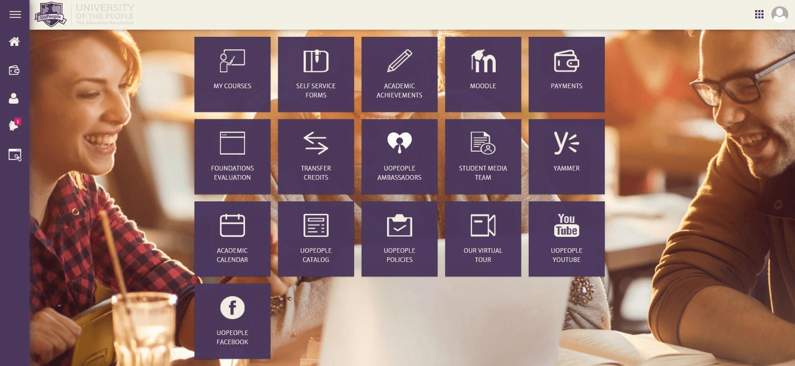
University of the People is a nonprofit, fully online university serving students around the world. The Student Portal is the primary place where students manage their academic lives by accessing courses, tracking progress, completing tasks, and finding critical information. The redesign focused on turning a fragmented "metro of apps" into a coherent student experience, reducing navigation friction, improving task visibility, and creating a mobile-first interface for a global student base with varying connectivity and digital fluency.
01Led the end-to-end product design lifecycle, bridging technical constraints with intuitive user experience.
02Created a clearer information architecture for critical academic flows.
03Prioritized mobile access, accessibility, and intent-based navigation.
04Designed for a global student population at scale.
Context
Why This Project Mattered
A growing global student base made portal friction more expensive.
UoPeople was operating across 200+ countries, with a strong concentration of students between ages 20 and 40 and a rapidly rising enrollment curve. That context pushed the redesign toward mobile-first clarity, faster task completion, and a product experience that could scale without adding support burden.
High course volume made buried tasks and fragmented navigation materially harder to manage.
Enrollment growth turned interface friction into a scale problem, not just a usability problem.
Problem Space
Navigation Complexity
Scattered information across multiple sub-sites led to confusion, high cognitive load, and frequently missed academic deadlines.
Task Management Challenges
Students struggled to track assignments, discussions, and progress due to lack of a centralized dashboard or priority view.
Inadequate User Experience
Legacy system was not mobile-optimized, alienating 60%+ of the global student base who rely solely on smartphones.
Methodology
Research & Process
Key Design Focus Areas
- Mobile-first for global access.
- Accessibility WCAG compliance.
- Simplicity through intent-based UI.
Discover & Define
Understanding the "Why" and "Who" through user surveys, 1:1 interviews, and pain-point analysis.
Ideate & Structure
Mapping flows and information architecture, personas, journey maps, and card sorting.
Design & Prototype
From low-fidelity wireframes to interactive high-fidelity prototypes in Figma.
Iterative Design
Progressed from low-fi wireframes to a cohesive hi-fi design system, validating logic with users at each stage.
Task Analysis
Mixed-methods research exposed friction across the core student journey.
Instead of looking only at screens, the analysis followed the actual path students take through the system: finding the right course, understanding what matters now, and knowing what to do next.
Login
Low Friction
Standard authentication was relatively straightforward and did not emerge as a core pain point.
Find Course
Pain Point
Students had to navigate across repeated menus and disconnected areas just to locate the current class.
Check Tasks
Major Friction
Assignment details, discussions, and deadlines were buried behind too many clicks and weak hierarchy.
Take Action
Pain Point
After submission, students often lacked a clear next step or visible confirmation that they were done.
Log Out
Neutral
The end of the session itself was not the issue. The friction was concentrated in the academic flow before it.
Research Insights
Student Satisfaction Survey
Overall Experience
Finding Info
Task Completion
Mobile Usage
Help Access
Qualitative Themes
Information Discovery
Finding basic course information was described as "difficult" and "buried," leading to support tickets.
Task Efficiency
Students struggled to complete basic tasks efficiently because core information and actions were too fragmented.
Priority Themes For Redesign
Navigation ClaritySimplicityEase of UseVisual Hierarchy
User Persona

Dr. Emma Mitchell
Time-Constrained Student
Balances studies with part-time work and depends on fast access to assignments, materials, and deadlines during short study windows.
Needs
- A single source of truth for academic tasks
- Lightweight, mobile-friendly access
- Clear deadline visibility and prioritization
Pain Points
- Course information is scattered across sections
- Unreliable connectivity disrupts access
- Basic resources take too many clicks to find
Goals
- Submit assignments on time without confusion
- Access course materials easily from mobile devices
- Stay organized across multiple classes and deadlines

Ahmed Al-Fayed
First-Generation Student
Relies on clear structure, visual guidance, and simple language to navigate coursework confidently in a system that often feels overwhelming.
Needs
- Simple, easy-to-understand language
- Strong visual hierarchy and guidance
- Clear next steps throughout the flow
Pain Points
- Academic terminology and instructions are unclear
- Priorities are hard to identify
- He is unsure what to do after completing tasks
Goals
- Pass each academic term successfully
- Understand assignment requirements and deadlines
- Navigate the portal independently without external help
Maria Rodriguez
Working Parent
Studies in short, focused sessions and needs immediate clarity on what is due, what needs attention, and what was completed.
Needs
- A focused dashboard for today's most urgent tasks
- Quick access to high-priority actions
- Clear visual confirmation and status tracking
Pain Points
- Essential information takes too many clicks to reach
- Deadlines are buried in nested menus
- Submission confirmation is unclear
Goals
- Quickly identify what needs to be done today
- Track grades and academic progress efficiently
- Complete tasks within short time windows
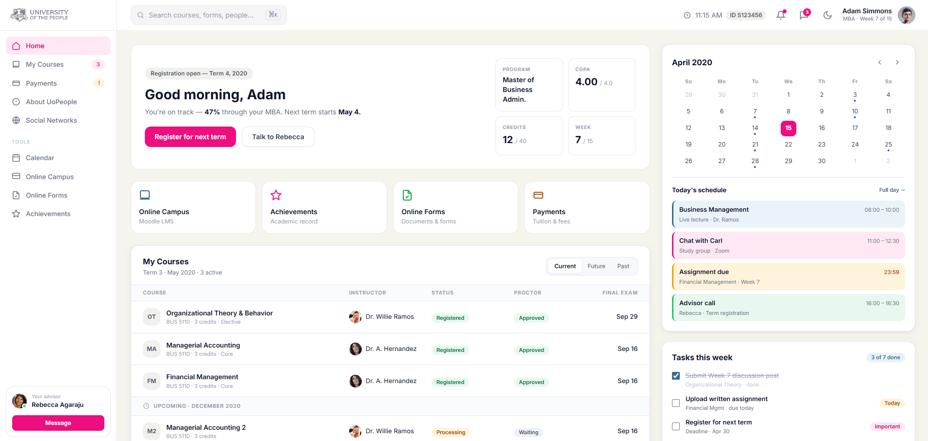
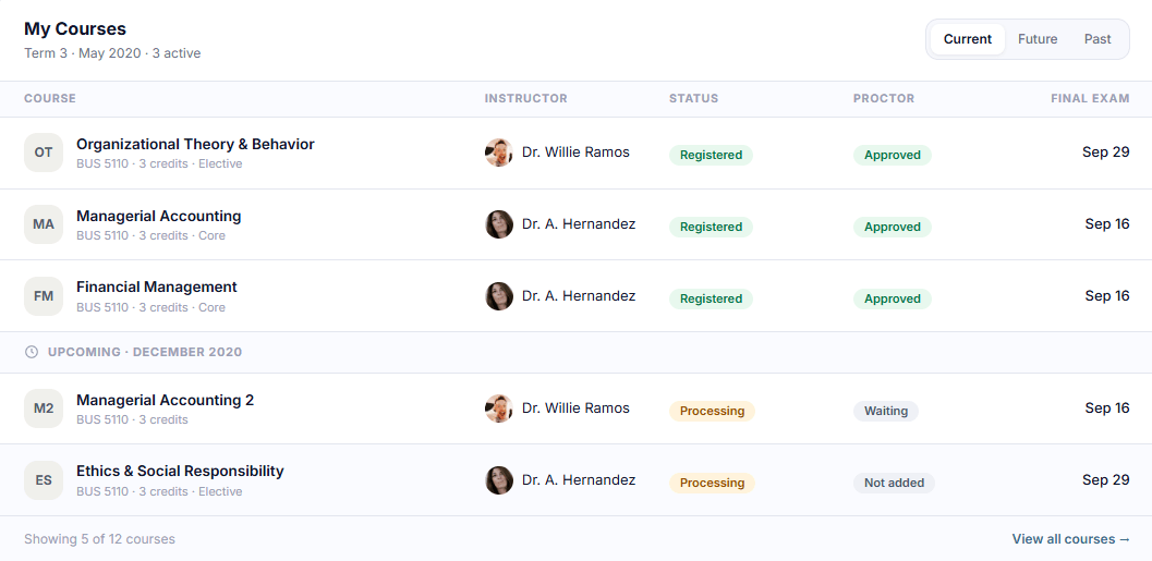
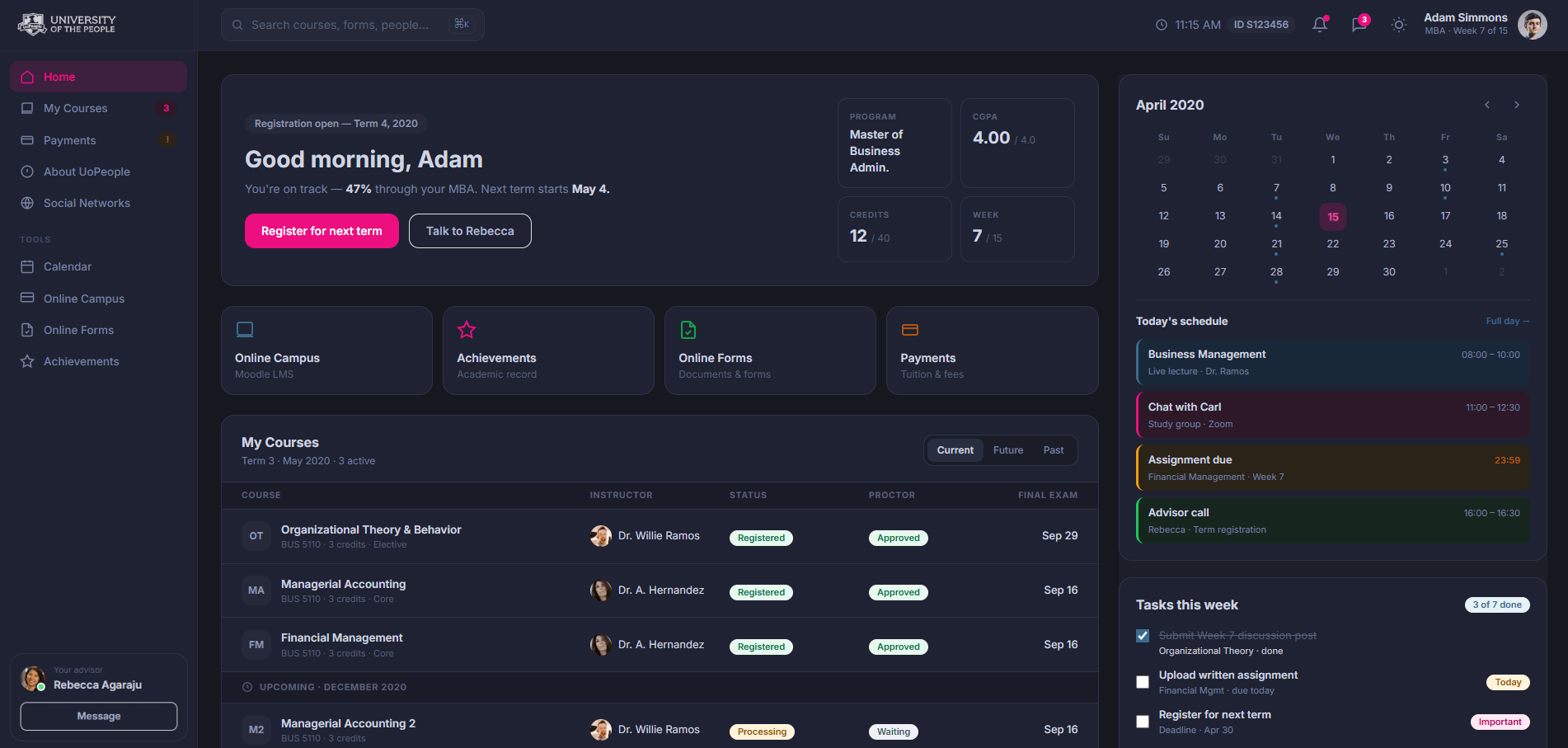
Student Dashboard
01The Problem
No Centralized Overview
Students had no centralized overview. Information was scattered across apps ("metro style"), leading to missed priorities, confusion, and lower engagement especially on mobile.
The Solution
Simplified Student Dashboard
- Centralized term status, classes, assignments, and deadlines in one view.
- Organized features around student goals such as today's tasks.
- Used a mobile-first layout with collapsible sections and stronger contrast.
- Made priority actions easier to identify and complete quickly.
Faster assignment access, better usability, and lower support burden across a global student base.
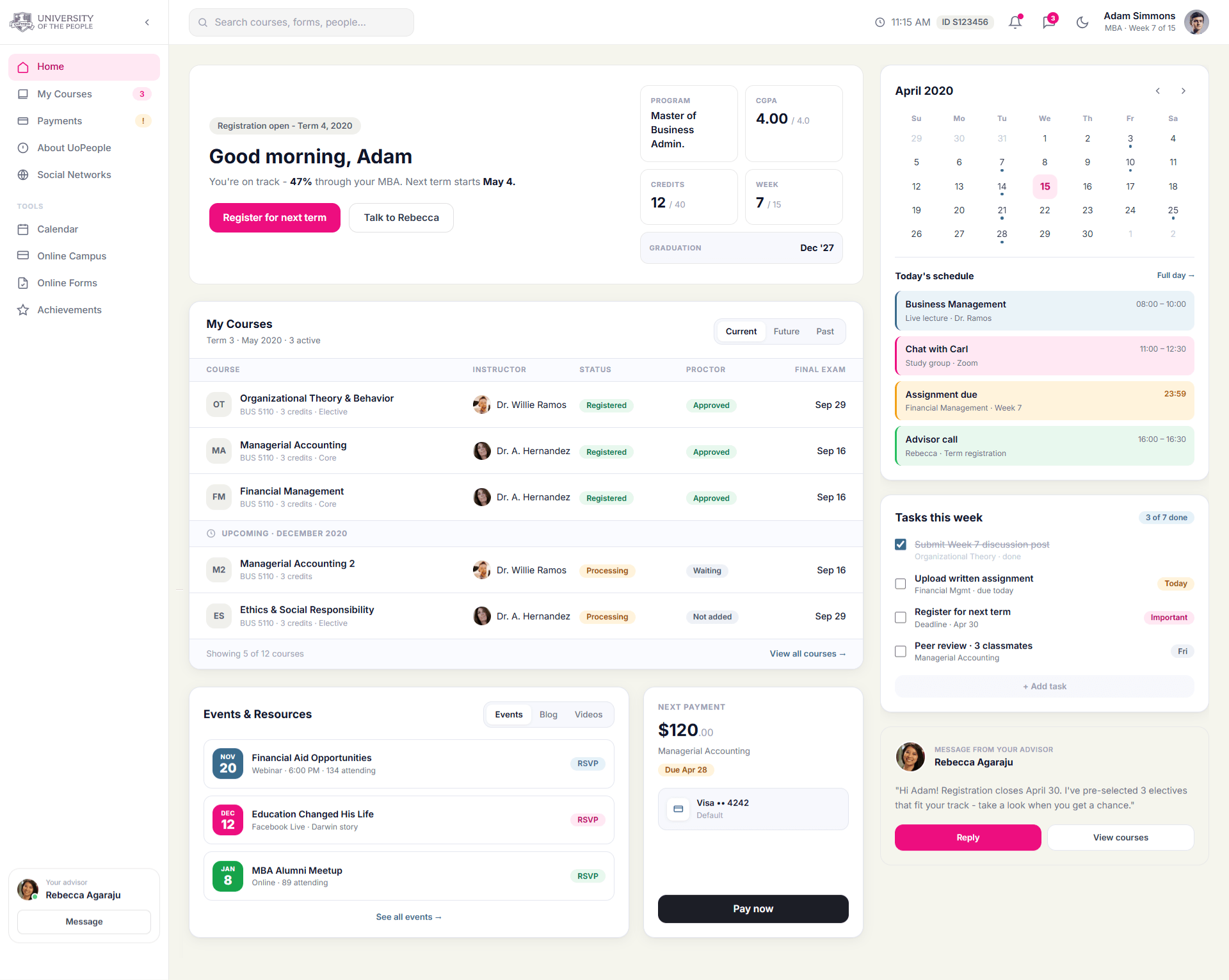
Course Access
02The Problem
Navigation Complexity
Course navigation was convoluted. Discussions, assignments, and materials required multiple clicks across different apps, causing frustration and inefficiency.
The Solution
Streamlined Course Access
- Direct, organized entry to each course with clear hierarchy.
- Integrated views for discussions, assignments, grades, and resources in one flow.
- Mobile-optimized with expandable sections, search, and notifications.
- Added accessibility features like keyboard navigation and screen reader support.
Reduced clicks and unified course workflows made core actions clearer and easier to complete.
Accessibility & Comfort
Dark mode
Designed for Late-Night Study Sessions
Dark mode supported students who study at night, work across time zones, or rely on the portal during long reading and task-management sessions. The goal was to reduce visual fatigue while keeping deadlines, course status, and priority actions easy to scan.
- Maintained clear hierarchy across courses, tasks, calendar events, and status cards.
- Reduced eye strain for extended study sessions and low-light environments.
- Preserved contrast and readability for high-priority academic actions.
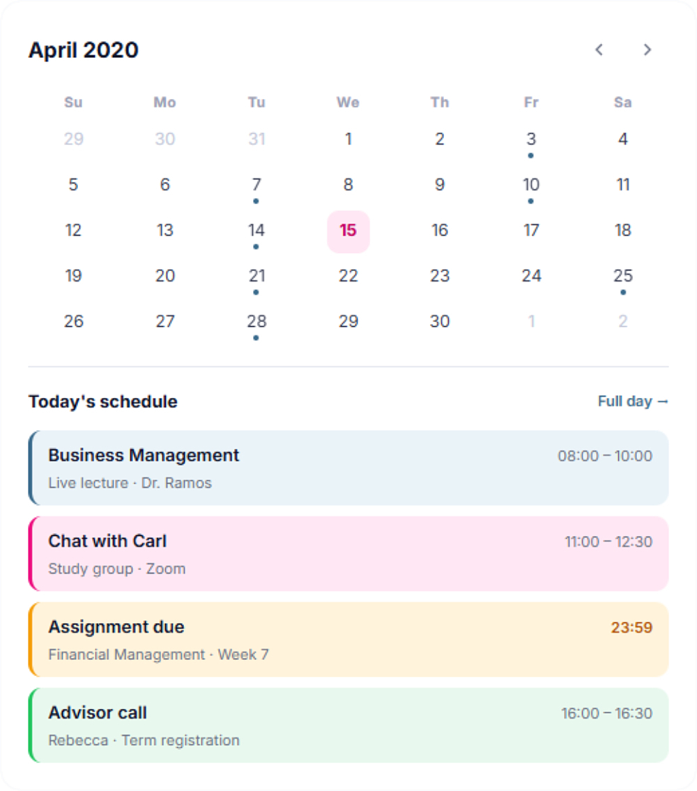
Design Tradeoff
Calendar integration
Choosing Product Clarity Over Technical Scope
One early direction was to connect the student calendar with Google Calendar, so classes, deadlines, and advisor sessions could sync with each student's personal schedule.
After reviewing the idea with engineering, we decided not to move forward with external calendar integration at this stage. OAuth permissions, privacy considerations, timezone handling, recurring events, and sync reliability would have added significant complexity while the core user need was simpler: helping students understand what needs attention today.
- Kept the academic calendar native to the portal.
- Reduced implementation and long-term maintenance risk.
- Focused the dashboard on clear daily priorities instead of external sync complexity.
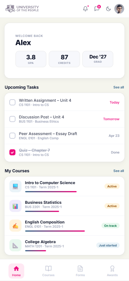
Mobile Experience
03The Problem
Disconnected Mobile Access
Over 60% of UoP students access the portal exclusively via mobile, yet the legacy system had no dedicated app experience - forcing students through a broken desktop layout on small screens.
The SolutionStudent Companion App
- Mobile-native layout with thumb-friendly navigation and a persistent bottom bar.
- Condensed hero card surfaces GPA, credits, and graduation date instantly.
- Priority task view shows today's deadlines without extra scrolling.
- Inline course progress bars let students track completion at a glance.
Impact & Results
0150K+Students affected
02+25%Course completion
03-40%Time on tasks
- Faster assignment access was achieved through a clearer dashboard and stronger hierarchy.
- Support tickets were reduced due to better usability and easier information discovery.
Key Learnings
User-Centered Design
Redesigning with empathy significantly boosts engagement and satisfaction in educational platforms.
Mobile-First
Essential for global accessibility, reducing friction for diverse users with varying device capabilities.
Continuous Feedback
Ongoing user research, such as Hotjar integration, is key for continuous UX optimization post-launch.
Next Project
Working on a complex product?
I design product experiences that bring clarity to complex systems.