Quantum Harmony Unleashed: Exploring the Future With Infinity Quantum
Where Quantum Meets Innovation: A Journey into the Next Frontier of Computing with Infinity Quantum.
Infinity Quantum: Simplifying a Complex Quantum Platform for Users.
A complete UX case study showcasing the redesign of a complex quantum resource management system.
Timeline
Mar - Apr 2023
PLATFORM
Website/ WebApp
MY ROLE
UX/UI Designer
Intro
Infinity Quantum is a hybrid Quantum + HPC computing platform used by researchers, engineers, and administrators to run quantum experiments, reserve QPUs, monitor jobs, and manage scientific teams. The earlier version of this internal platform was extremely technical, inconsistent, and difficult to operate without deep system knowledge. My goal was to redesign the entire experience to make complex quantum workflows clear, intuitive, and predictable—even for non-technical users.
My Role
Infinity Quantum is a hybrid Quantum + HPC computing platform used by researchers, engineers, and administrators to run quantum experiments, reserve QPUs, monitor jobs, and manage scientific teams. The earlier version of this internal platform was extremely technical, inconsistent, and difficult to operate without deep system knowledge. My goal was to redesign the entire experience to make complex quantum workflows clear, intuitive, and predictable—even for non-technical users.
Research
USER RESEARCH: Before defining the solution, I conducted foundational research to understand how researchers, engineers, managers, and admins interacted with the platform. This included observational analysis of workflows, interviews with technical users, and reviewing internal notes and pain points.
Research Methods Used
Contextual inquiry
observing how engineers and researchers operated the old platform.
Stakeholder interviews
discussions with managers and admins about workflow bottlenecks.
Usability review
evaluating the old interface using heuristic principles.
Task analysis
mapping key tasks such as running
Key Research Insights
Users struggled to understand where to begin due to poor hierarchy.
Navigation was unpredictable critical actions were hidden or deeply nested.
Technical users needed advanced data, but non‑technical roles found it overwhelming.
The system felt inconsistent, requiring memorization or training to operate.
Long work sessions demanded dark‑mode optimization and reduced eye strain.
Data across jobs, resources, and users lacked structure, making cross‑team collaboration harder.
IBM Quantum Experience – Rich visualizations but overwhelming UI for new users.
NVIDIA DGX Quantum – Strong at system health metrics but lacks UX clarity.
Azure Quantum – Simplified onboarding but table-heavy interactions.
Key Insights from Competitors
Most competitors expose too much technical data upfront.
User flows are not optimized for researchers performing repetitive tasks.
Tables and logs often lack hierarchy, causing cognitive overload.
Few platforms provide strong group/role management tools.
Opportunity Identified
Infinity Quantum could differentiate by:
Providing a scientifically optimized dark mode.
Using progressive disclosure to manage technical depth.
Delivering multi-role dashboards tailored for each persona.
Creating a predictable design system across all screens.
Problem
We faced the challenge of making quantum computing visually accessible. How do you translate complex quantum concepts into an intuitive design that researchers and developers can effortlessly navigate?
Defining the problem
" How can we visually simplify complex quantum concepts for intuitive design, ensuring accessibility for researchers and developers?"
About Dr. Maya Levi
Dr. Maya Levi is an experienced quantum researcher working on complex experiments that require constant iteration, monitoring, and refinement. She often runs multiple jobs in parallel and relies heavily on accurate logs, calibration data, and resource availability. Her work demands clarity and speed—any friction in the interface directly slows down scientific progress.
Goals:
Run quantum experiments efficiently.
Monitor job states, logs, and calibration data.
Access resources without waiting on admin support.
Frustrations:
Dense tables that were hard to filter.
Technical data displayed without structure.
Slow navigation between jobs and resources.
Needs
Dense tables that were hard to filter.
Technical data displayed without structure.
Slow navigation between jobs and resources.
About Dr. Amir Cohen
Amir Cohen is responsible for maintaining system stability and ensuring that researchers have the resources they need. His daily tasks involve managing users, approving credit and resource requests, and monitoring system health. He works under pressure and needs clarity, consistency, and predictability. A confusing UI can lead to errors that affect the entire organization, so he relies heavily on clean group structures and quick administrative actions.
Goals:
Approve credit requests and reservations.
Monitor overall system health.
Maintain consistency in organizational groups.
Frustrations:
Hard to distinguish between parent groups and subgroups.
Unclear approval workflows.
No centralized summary of system status.
Needs
A unified dashboard.
Clear labeling of roles, groups, and permissions.
Streamlined approval processes.
About Dr. Dana Weiss
Dana Weiss oversees multiple research teams and must balance performance, resource allocation, and project timelines. She depends on high-level insights and clear organizational structures to make strategic decisions. Her work requires clarity, accuracy, and the ability to quickly understand team progress without digging through scattered screens.
Goals:
Track team performance and resource costs.
Manage users, roles, and access.
Review experiment outcomes.
Frustrations:
Scattered information across multiple pages.
Tables with no grouping or hierarchy.
Difficulty viewing organizational structure.
Needs
High‑level insights at a glance.
Clean, structured data tables.
A predictable, consistent system.
Wireframes
low fidelity wireframes helped us craft a better story for the end users. This also helped to bring all the stake holders on the same page
Design
Embarking on the design journey, we drew inspiration from the core principles of accessibility and user engagement. The objective was to personify the brand, shaping its identity and logo to communicate its instrumental role in simplifying complex quantum concepts for researchers and developers. Adopting a visually striking color palette, animations, and thoughtful spacing, our design aimed to enhance user understanding, drawing attention to details while fostering enthusiasm and intelligence in the quantum computing space.
Typeface
Poppins
Poppins, a modern and versatile typeface, adds a touch of sophistication and clarity to the design, embodying a perfect balance between elegance and readability.
Aa
Poppins Bold for heading
Aa
Poppins semibold for buttons
Aa
Poppins Regular for body
Colors
The deep and resonant shade of 221E49 serves as the primary color, exuding a sense of sophistication and creating a visually compelling narrative for the case study.
Brand colors
All About You:
We revamped our buttons to make sure your experience is top-notch and super easy.
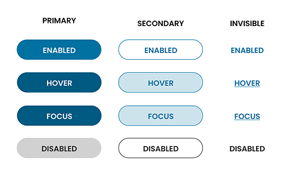
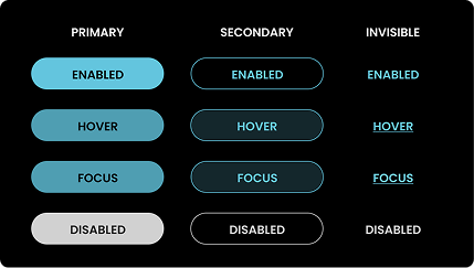
UI Elements
To ensure design scalability, brand recognition & consistency across all digital touchpoints, we developed a complete UI ket.
UI Elements
To ensure design scalability, brand recognition & consistency across all digital touchpoints, we developed a complete UI ket.
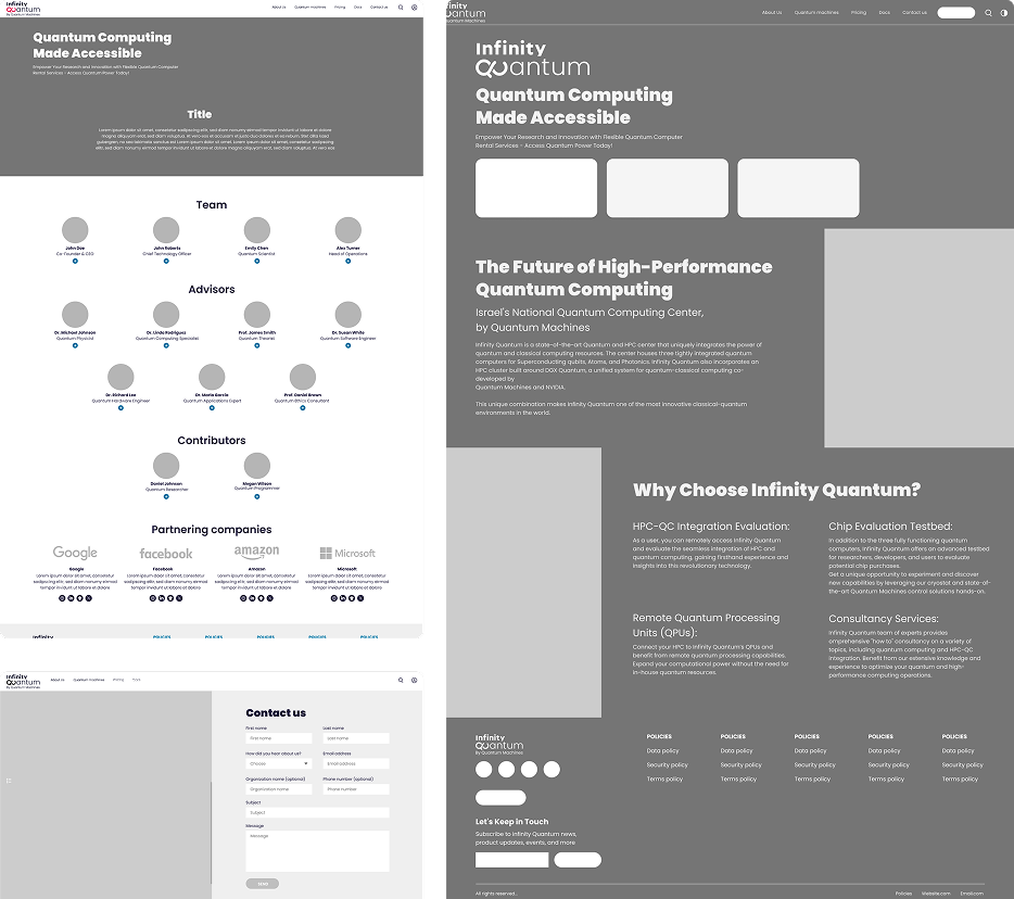
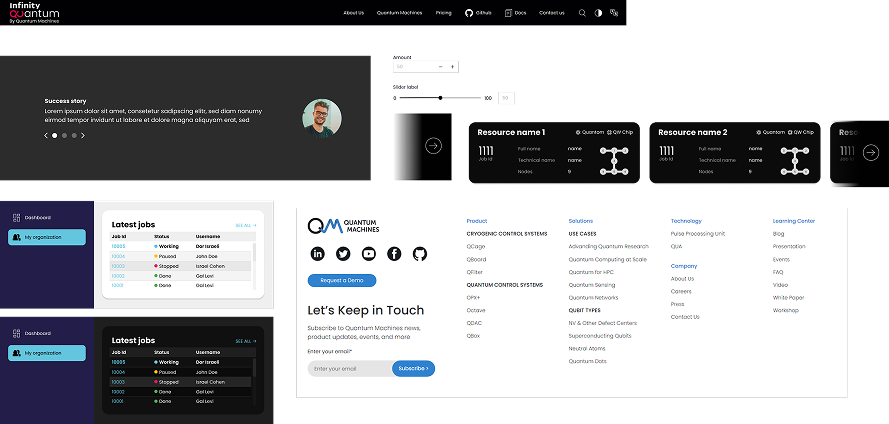
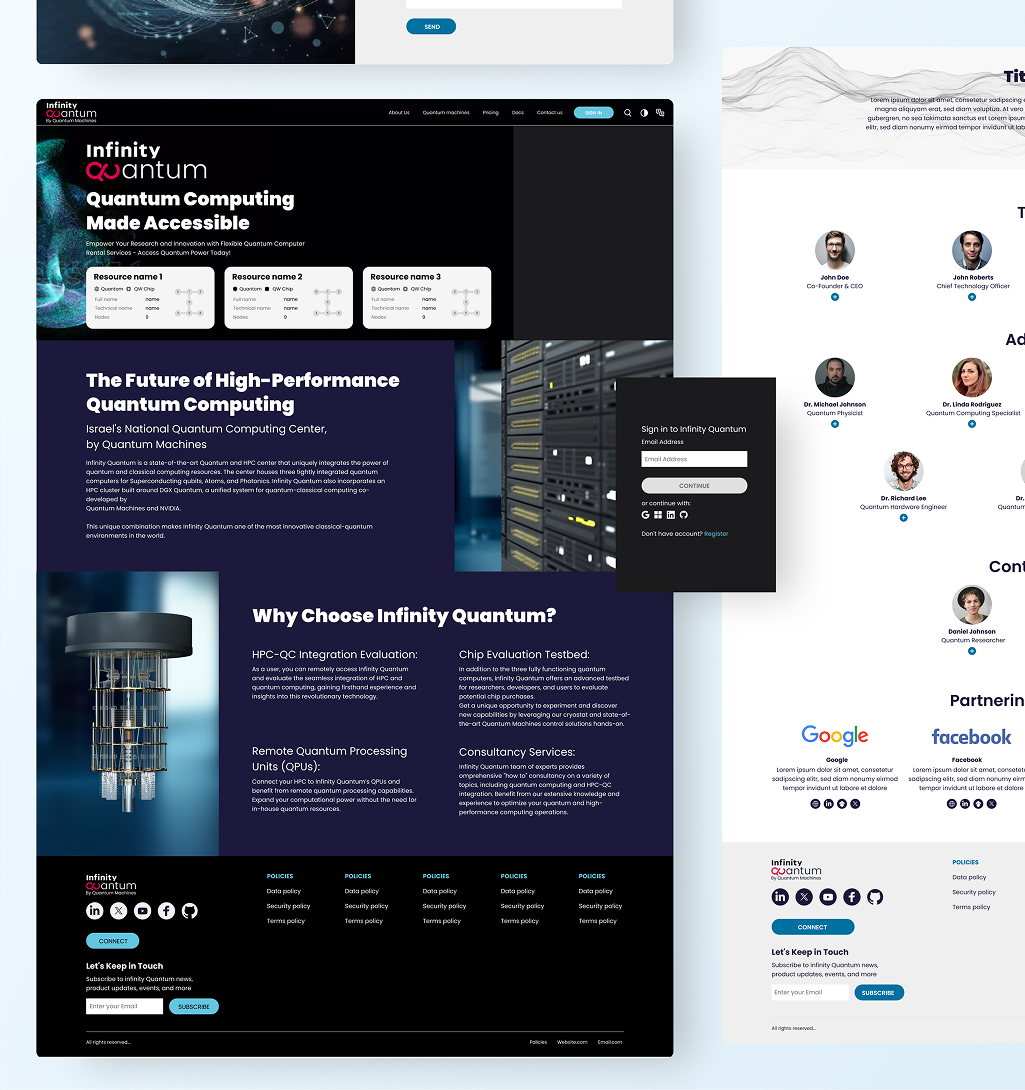
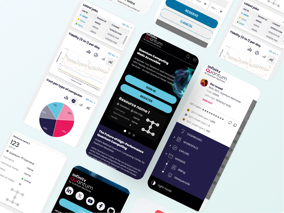
Home Page
KEY USER FLOWS
Job Review Flow
Allows researchers to quickly open a job, view full details, and access SLURM logs within a structured popup.
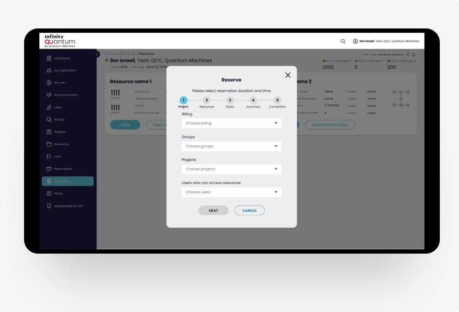
Resource Booking
Enables users to review a quantum resource and complete a clear, guided reservation process in a few steps.
Job Review Flow
Allows researchers to quickly open a job, view full details, and access SLURM logs within a structured popup.
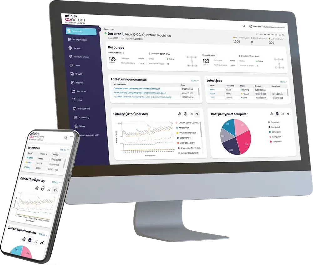
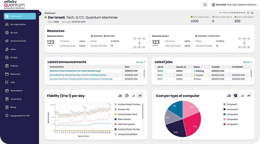
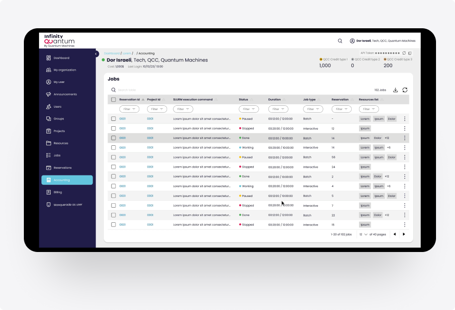
DashBoard
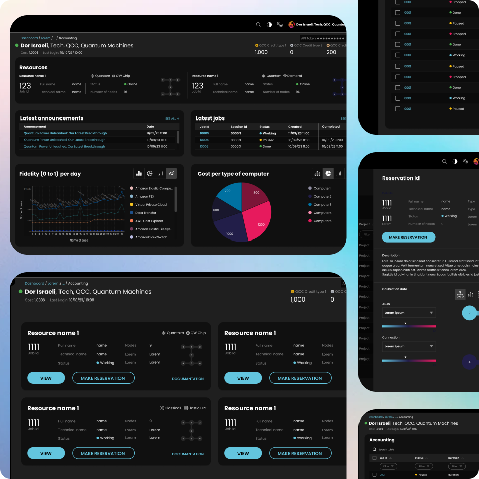
Dark Mode
Responsive Design
Next steps
Continue to design better experiences
To follow through our product roadmap and continue to stick to our design principles.
Thank you for reading through! Hope you enjoyed learning about my design and thought process. 🙂
Let’s connect!
Thank you for your time reviewing my work If you’d like be more or get in touch, my contact information is provided below.