IDAN SHADI
AppCard
Streamlining Loyalty & Marketing for Higher Merchant Retention and Customer Engagement
Timeline
6 months (2018–2019)
Client
Technology company
MY ROLE
Product UX/UI Lead
Project Overview
AppCard is a data-driven loyalty and customer engagement platform that helps retailers turn transaction data into personalized marketing experiences. The goal was to simplify complex analytics and campaign tools into an intuitive, actionable dashboard for store owners and marketing teams. Through user-centered design and strategic UX decisions, the platform improved visibility into customer behavior, campaign performance, and ROI tracking.
My Responsibility
End-to-end UX strategy, user research, wireframes to prototypes, usability testing, design system, cross-team collaboration
The Challenge
Merchants struggled with a fragmented, inefficient platform that hindered their ability to engage customers effectively.
Navigation Complexity
Tools for campaigns, reports, and customer data were scattered across different interfaces, forcing users to switch contexts frequently.
Task Management Challenges
Merchants found it difficult to create and track campaigns, analyze performance metrics, or optimize loyalty programs without guidance.
Inadequate User Experience
The platform was not mobile-optimized and imposed a high cognitive load, leading to low adoption rates and poor merchant retention.
Methodology
Research & Process
Key Design Focus Areas
- Mobile-First For global access
- Accessibility WCAG Compliance
- Simplicity Intent-based UI
Competitive Audit
Analyzed 5 major loyalty platforms to identify gaps in usability and features.
Design Iteration
Moved from low-fi wireframes to a hi-fi design system with a mobile-first focus.
Discover & Define
Conducted user interviews, surveys, and pain-point analysis with 20+ retailers.
Definition
Created 3 core personas and mapped user journeys to visualize merchant workflows.
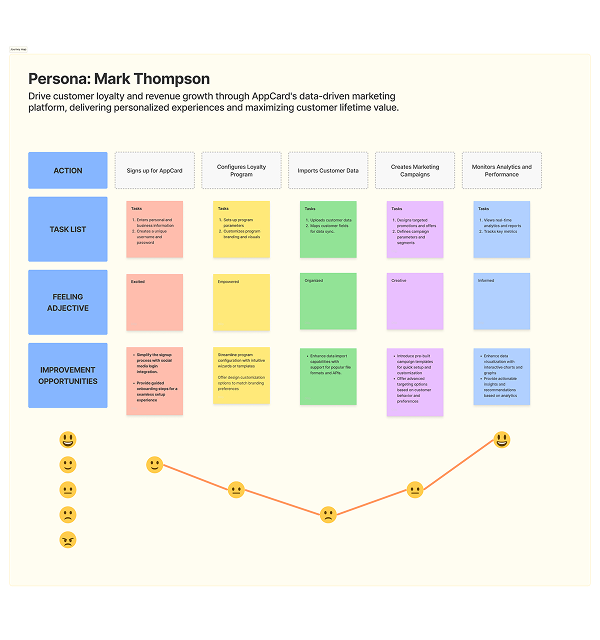
User Journey Map
Drive customer loyalty and revenue growth through AppCard’s data-driven marketing platform, delivering personalized experiences and maximizing customer lifetime value.
About Dr. Emma Mitchell
Emma Mitchell is a 23-year-old Computer Science student balancing her coursework with a part-time job. She studies during short windows — on her commute, during lunch breaks, or late at night. With limited time and occasional connectivity issues, Emma depends on the student portal to quickly access assignments, materials, and deadlines. Any friction in navigation directly increases stress and reduces her productivity.

Goals:
- Submit assignments on time without confusion.
- Access course materials easily from mobile devices.
- Stay organized across multiple classes and deadlines.
Frustrations:
- Scattered course information across different sections.
- Spotty internet connection affecting access.
- Too many clicks to locate basic resources.
Needs
- A single, centralized dashboard for all academic tasks.
- Mobile-first, lightweight experience.
- Clear deadline visibility and task prioritization.
Ahmed Al-Fayed
Ahmed Al-Fayed is a first-generation university student and English is not his first language. He is highly motivated to succeed but often feels overwhelmed by complex systems and academic terminology. Ahmed relies on clear structure, visual guidance, and simple language to confidently navigate his coursework. When the portal lacks clarity, it creates uncertainty and slows his academic progress.

Goals:
- Successfully pass each academic term.
- Clearly understand assignment requirements and deadlines.
- Navigate the portal independently without external help.
Frustrations:
- Simple, easy-to-understand language.
- Clear visual indicators for task status and priority.
- Predictable navigation with consistent structure.
Needs
- Complex academic jargon and unclear instructions.
- Poor visual hierarchy that hides priorities.
- Confusion about next steps after completing tasks.
User Persona
The Problem
Information Overload
Dashboards were cluttered with non-essential data, creating high cognitive load and making it difficult to find key metrics.
The Solution
Unified Dashboard & Real-Time Insights
- Redesigned the merchant dashboard with a mobile-first, action-oriented approach
- Consolidated key performance metrics into a single unified view for faster decision-making.
- Enabled real-time data visualization and personalized alerts to drive immediate action.
- Reduced navigation complexity and centralized data into a single, actionable dashboard.

The Problem
Workflow Friction
Creating campaigns required navigating lengthy, multi-step forms with no visual previews, leading to user errors.
The Solution
Smart Campaigns & Automated ROI
- Replaced complex campaign forms with a guided, step-by-step wizard to simplify creation.
- Streamlined the workflow to reduce friction and improve campaign setup efficiency.
- Integrated real-time analytics to track open rates, conversions, and ROI for data-driven optimization.
- Achieved by replacing complex forms with a guided, step-by-step campaign builder.
Impact & Results
Impact Metrics
- Merchants can access key performance data significantly faster through the new dashboard widgets.
- The guided campaign wizard cut the time required to launch a new marketing offer in half.
- Improved UX led to higher satisfaction scores and reduced churn among small business owners.
- The modular design system now supports both B2B and B2C use cases seamlessly.
High
Retention Rate
Key Learnings
01
Mobile-First Critical
Even for complex B2B platforms, busy merchants rely on mobile. Designing for small screens first forced us to prioritize only the most essential actions, boosting overall adoption.
02
Previews Build
Merchants were hesitant to launch campaigns blindly. Introducing real-time visual previews significantly reduced errors and increased the speed of campaign deployment
03
Continuous Feedback
Integrating A/B testing tools didn’t just help merchants; it created a continuous feedback loop that informed our own product roadmap and feature prioritization.