IDAN SHADI
University of People
Driving higher student completion through simpler, mobile-first access for 50,000+ global students.
Timeline
April 2021 – Nov 2021
Client
Non-profit Online University
MY ROLE
Product UX/UI Lead
Project Overview
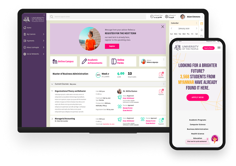
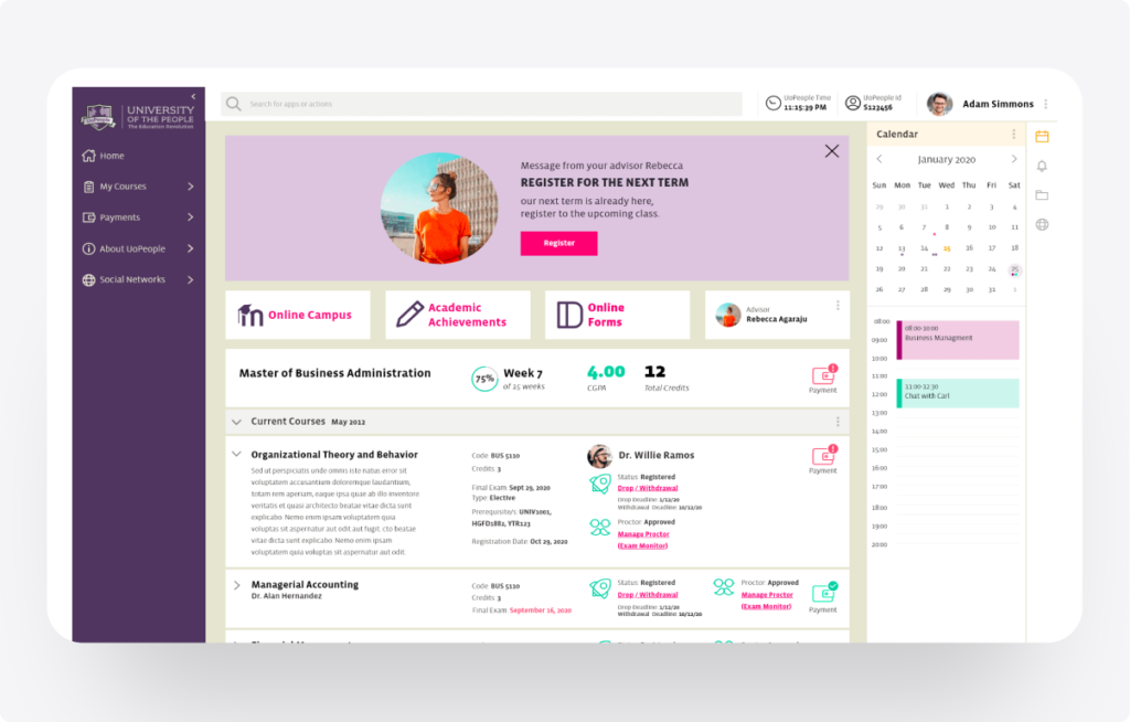
University of the People (UoPeople) is a nonprofit, fully online university serving students around the world. The Student Portal is the primary place where students manage their academic lives accessing courses, tracking progress, completing tasks, and finding critical information.
My Responsibility
I led the end-to-end product design lifecycle, bridging the gap between deep technical constraints and intuitive user experience.
The Challenge
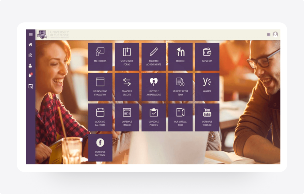
The existing portal was a fragmented “metro of apps” requiring navigation across multiple isolated systems, creating friction for students.
Navigation Complexity
Scattered information across multiple sub-sites led to confusion, high cognitive load, and frequently missed academic deadlines.
Task Management Challenges
Inadequate User Experience
Legacy system was not mobile-optimized, alienating 60%+ of the global student base who rely solely on smartphones.
Methodology
Research & Process
Key Design Focus Areas
- Mobile-First For global access
- Accessibility WCAG Compliance
- Simplicity Intent-based UI
Ideate & Structure
Mapping flows and information architecture, PersonasJourney & MapsCard Sorting
Iterative Design
Progressed from low-fi wireframes to a cohesive hi-fi design system, validating logic with users at each stage.
Discover & Define
Understanding the "Why" and "Who" User Surveys, 1:1 Interviews, Pain-point & Analysis
Design & Prototype
From low-fidelity to interactive high-fidelity, Paper WireframesInteractive PrototypesFigma
Qualitative Themes
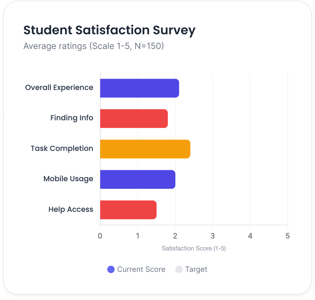
Information Discovery
Finding basic course information was described as "difficult" and "buried," leading to support tickets.
Task Efficiency
Finding basic course information was described as "difficult" and "buried," leading to support tickets.
Priority Themes for Redesign
About Dr. Emma Mitchell
Emma Mitchell is a 23-year-old Computer Science student balancing her studies with a part-time job. She often studies during short breaks — on her commute, during lunch, or late at night. With limited time and occasional internet issues, Emma relies heavily on the student portal to quickly access assignments and course materials. Any friction or confusion in navigation directly impacts her productivity and increases stress.
Goals:
- Submit assignments on time without confusion.
- Access course materials easily from mobile devices.
- Stay organized across multiple classes and deadlines.
Frustrations:
- Scattered course information across different sections.
- Spotty internet connection affecting access.
- Too many clicks to locate basic resources.
Needs
- A single source of truth for all academic tasks.
- Offline-friendly access or lightweight mobile experience.
Ahmed Al-Fayed
Ahmed Al-Fayed is a first-generation university student and English is not his first language. He is highly motivated to succeed but often finds academic systems overwhelming and difficult to interpret. He depends on clarity, visual guidance, and straightforward language to confidently navigate his coursework. When the portal feels complex or overloaded with jargon, it slows his progress and creates uncertainty.
Goals:
- Pass each academic term successfully.
- Clearly understand assignment requirements and deadlines.
- Navigate the portal independently without external help.
Frustrations:
- Simple, easy-to-understand language.
- High-contrast, accessible design for clarity.
Needs
- Complex academic terminology and unclear instructions.
- Poor visual hierarchy making priorities hard to identify.
- Confusion about next steps after completing tasks.
About Maria Rodriguez
Maria Rodriguez is a working parent managing her education alongside family responsibilities. She often studies in short, focused sessions while her child is asleep or between daily tasks. With limited uninterrupted time, Maria needs immediate clarity about what is due and what requires attention. If important information is buried in menus or scattered across pages, she risks missing deadlines.

Goals:
- Quickly identify what needs to be done today.
- Track grades and academic progress efficiently.
- Complete tasks within short time windows.
Frustrations:
- A “Today’s Tasks” focused dashboard view.
- Quick-access buttons for high-priority actions.
- Clear visual confirmation and status tracking.
Needs
- Too many clicks to find essential information.
- Deadlines hidden within nested menus.
- Lack of clear confirmation after submitting assignments.
User Persona
The Problem
No centralized overview.
Students had no centralized overview. Information was scattered across apps (“metro style”), leading to missed priorities, confusion, and lower engagement especially on mobile.
The Solution
Simplified Student Dashboard
- Unified High-Level View Centralized term status, classes, assignments, and deadlines in one view.
- Intent-Based Grouping Features organized by student goals (e.g., "Today's Tasks") rather than system silos.
- Mobile-First Layout Responsive design with collapsible sections, high contrast, and alt text.
- Achieved through simplified navigation and intent-based task grouping.
The Problem
Navigation Complexity
Course navigation was convoluted. Discussions, assignments, and materials required multiple clicks across different apps, causing frustration and inefficiency.
The Solution
Streamlined Course Access
- Unified High-Level View Centralized term status, classes, assignments, and deadlines in one view.
- Intent-Based Grouping Features organized by student goals (e.g., "Today's Tasks") rather than system silos.
- Mobile-First Layout Responsive design with collapsible sections, high contrast, and alt text.
- By reducing clicks and unifying course workflows.
Impact & Results
Impact Metrics
- Across 50K+ students
- Faster assignment access
- Reduced Support Tickets Due to better usability
Reduced
Support Ticket
Key Learnings
01
UserCentered Design
Redesigning with empathy significantly boosts engagement and satisfaction in educational platforms.
02
Mobile-First
Essential for global accessibility, reducing friction for diverse users with varying device capabilities.
03
Continuous Feedback
Ongoing user research (e.g., Hotjar integration) is key for continuous UX optimization post-launch.